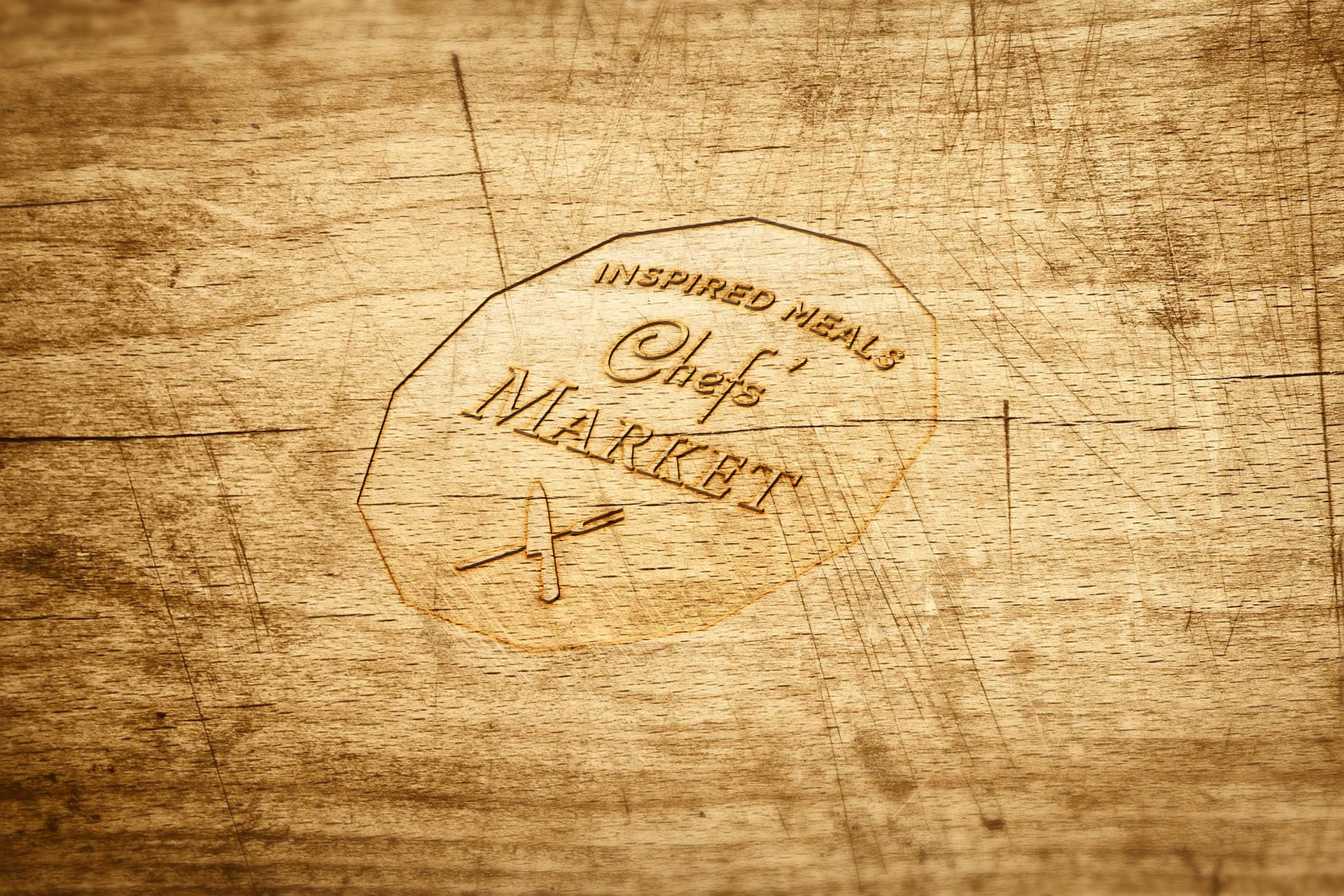
The logo mimicked a bistro sign. The hand-crafted artisan look helps negate the clinical aspect of the product.

The gourmet feeling carried over into to sales collateral. The goal was to make the food a reward to be savored, not a punishment for dietary mistakes.

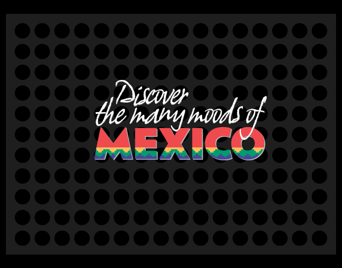
The color palette helped to designate different food items with a wide variety of options.