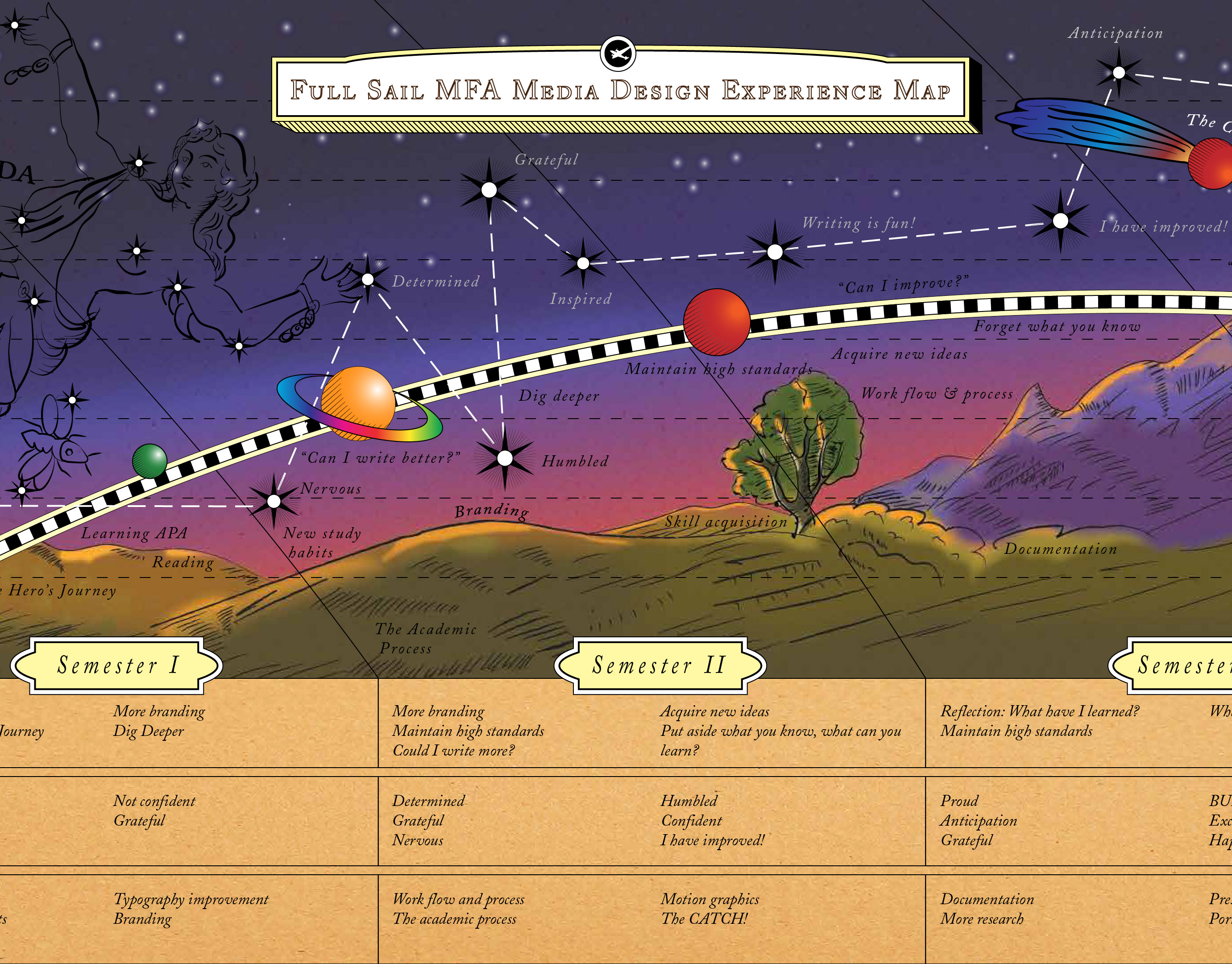
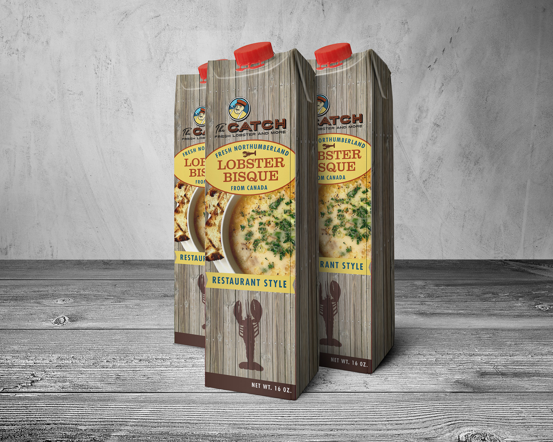
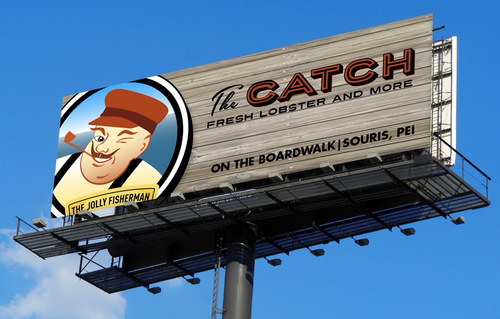
The wood texture was a key image to convey the rustic and nautical aspects of the brand.

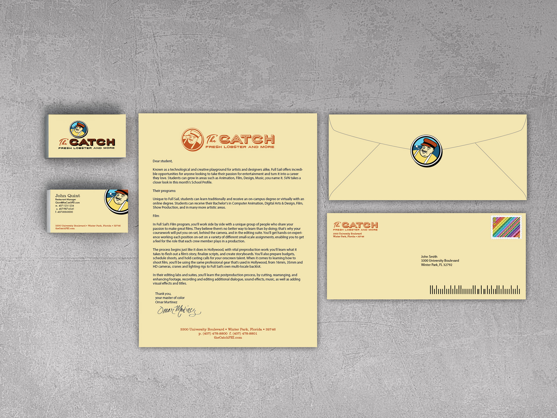
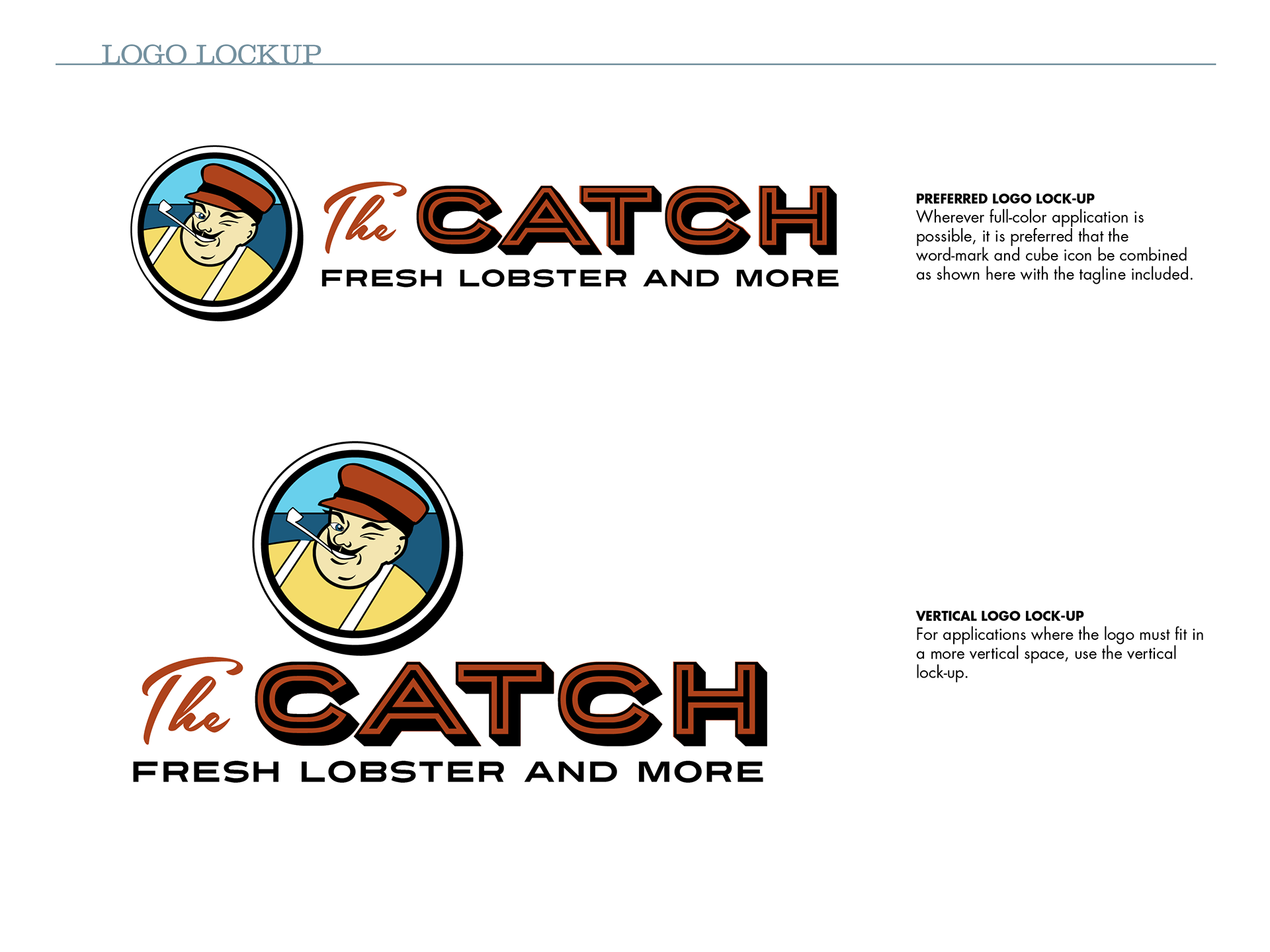
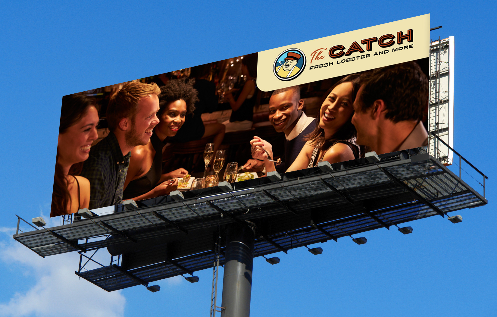
The color logo for The Catch uses an icon logotype configuration. that is highly flexible and works on multiple media platforms.

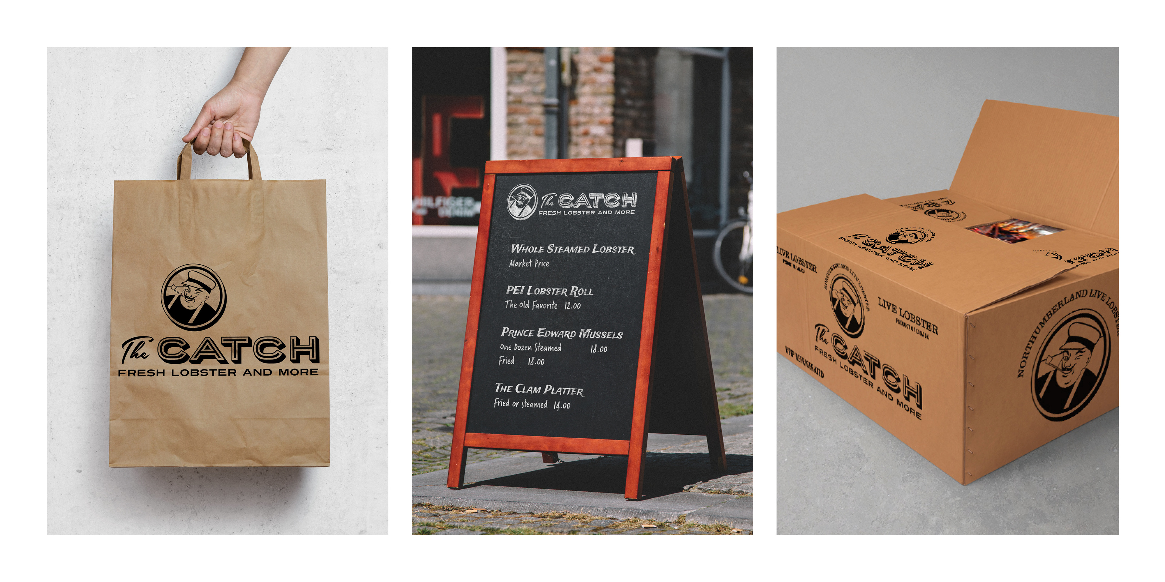
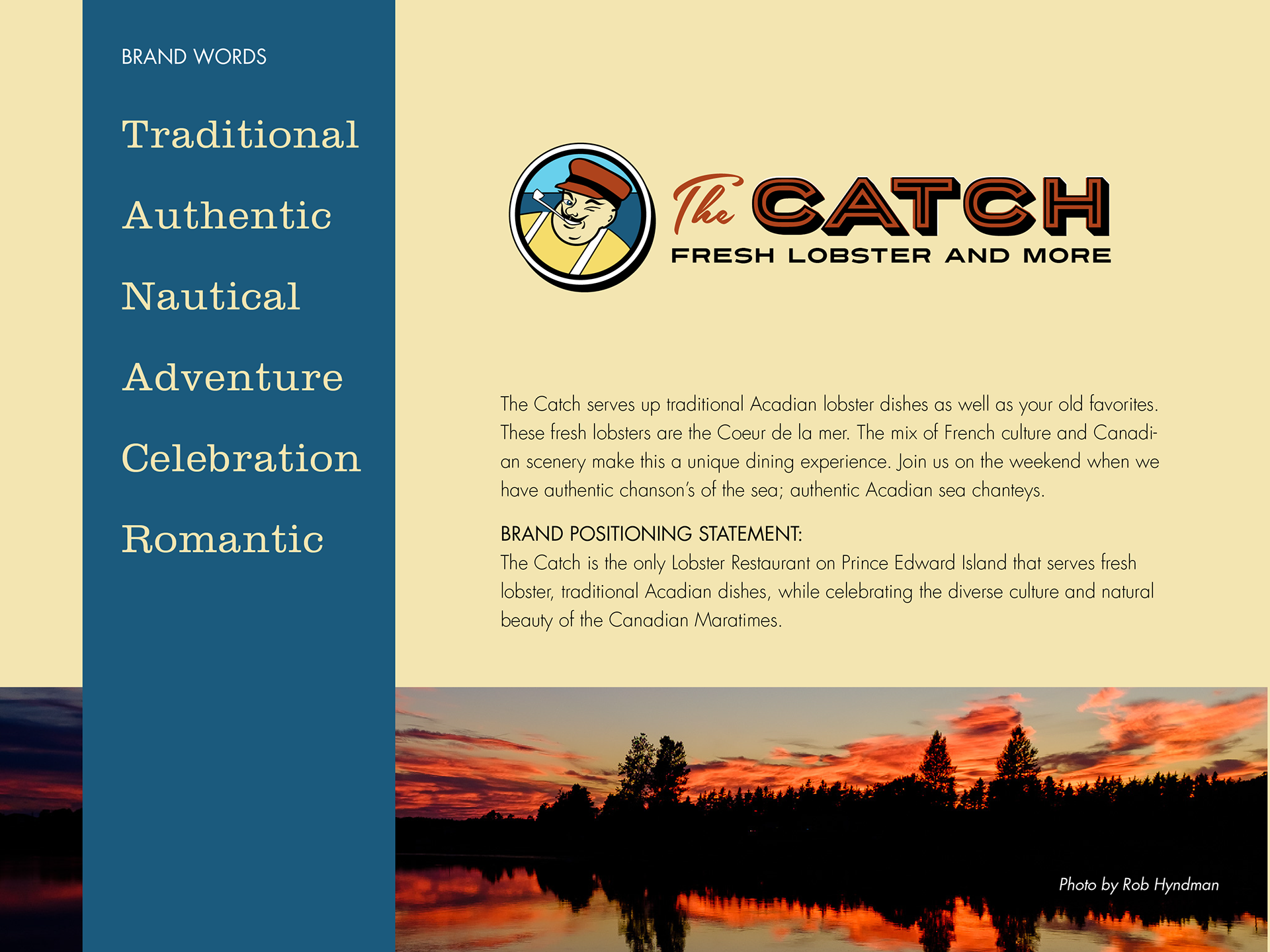
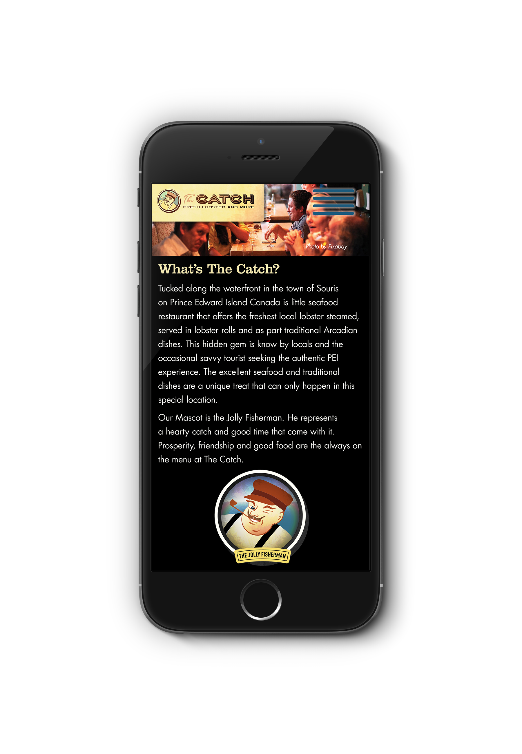
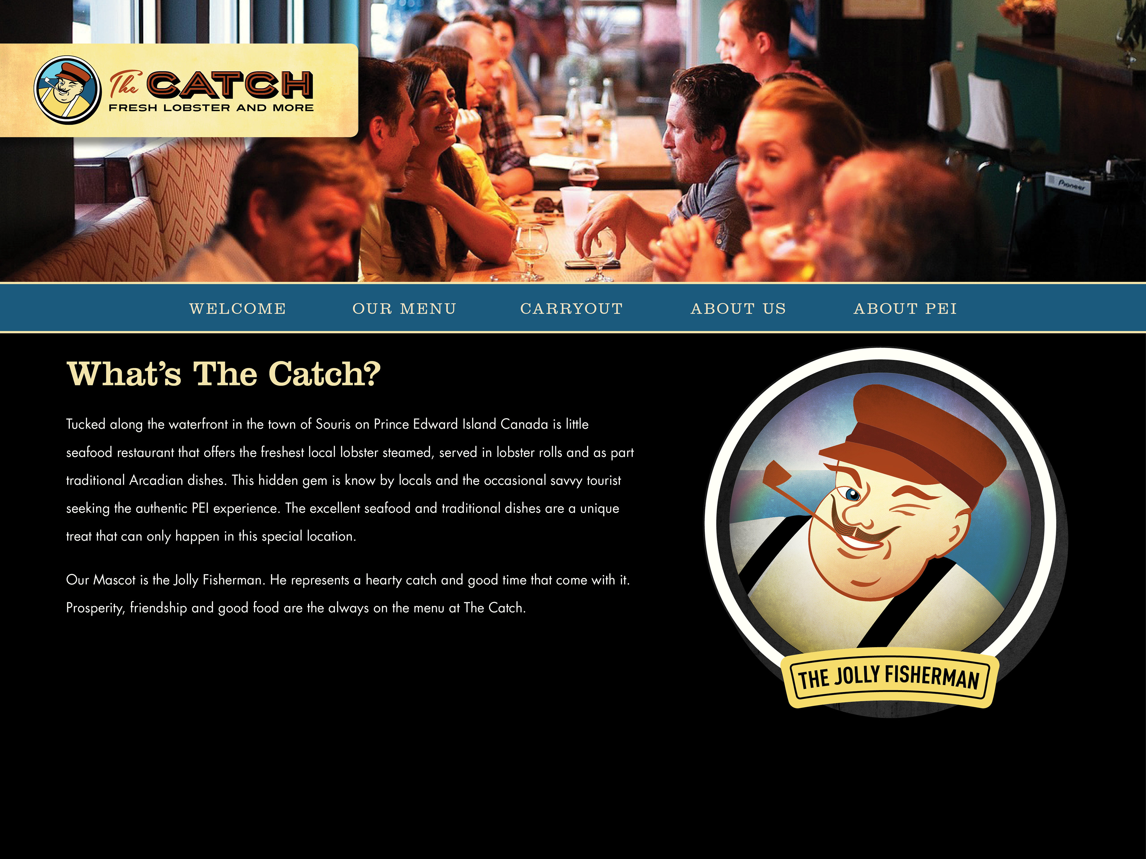
The icon for The Catch. The idea behind this character is to create a successful happy fisherman that embodies prosperity and good times.
Motion graphic using a smoke wipe.
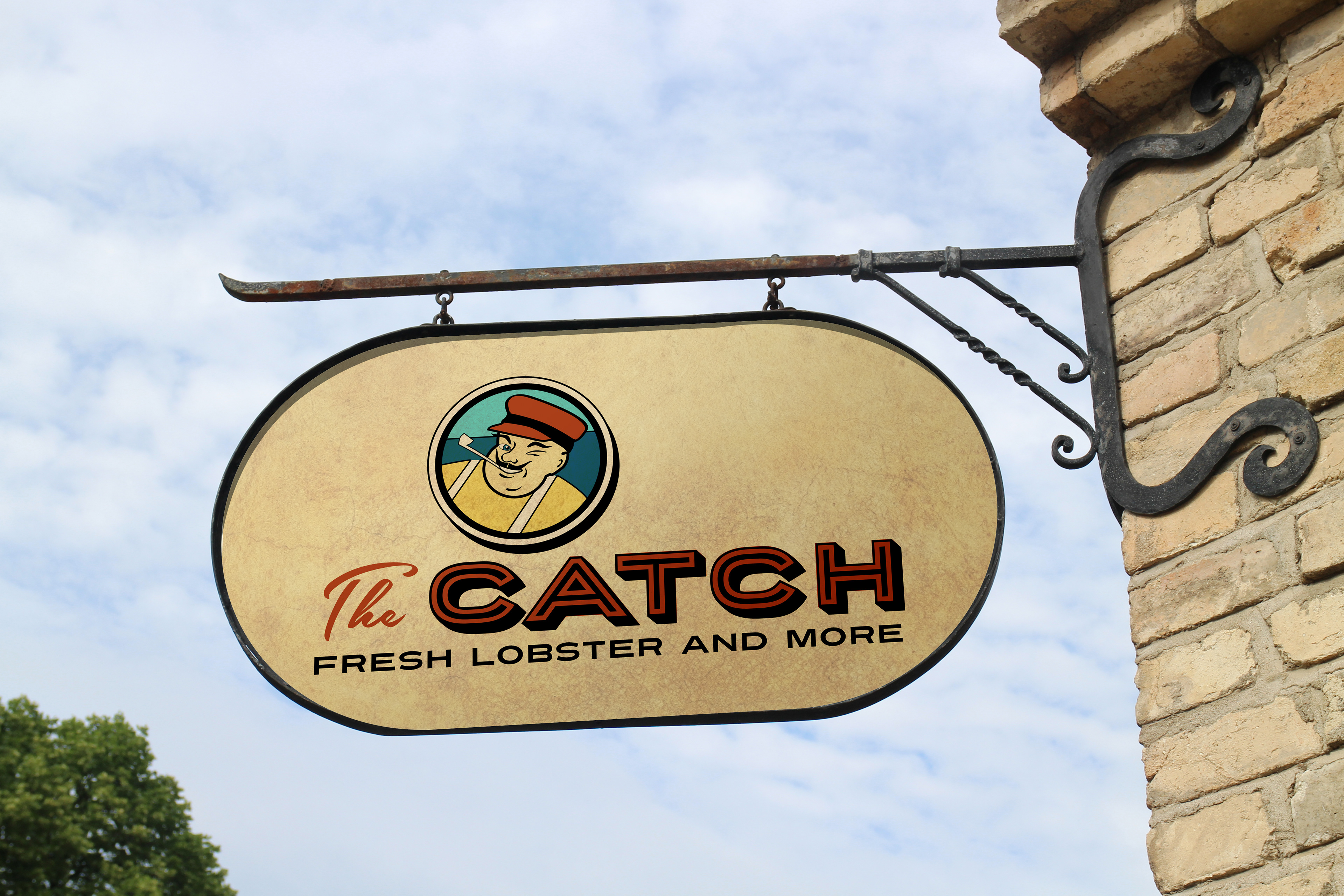


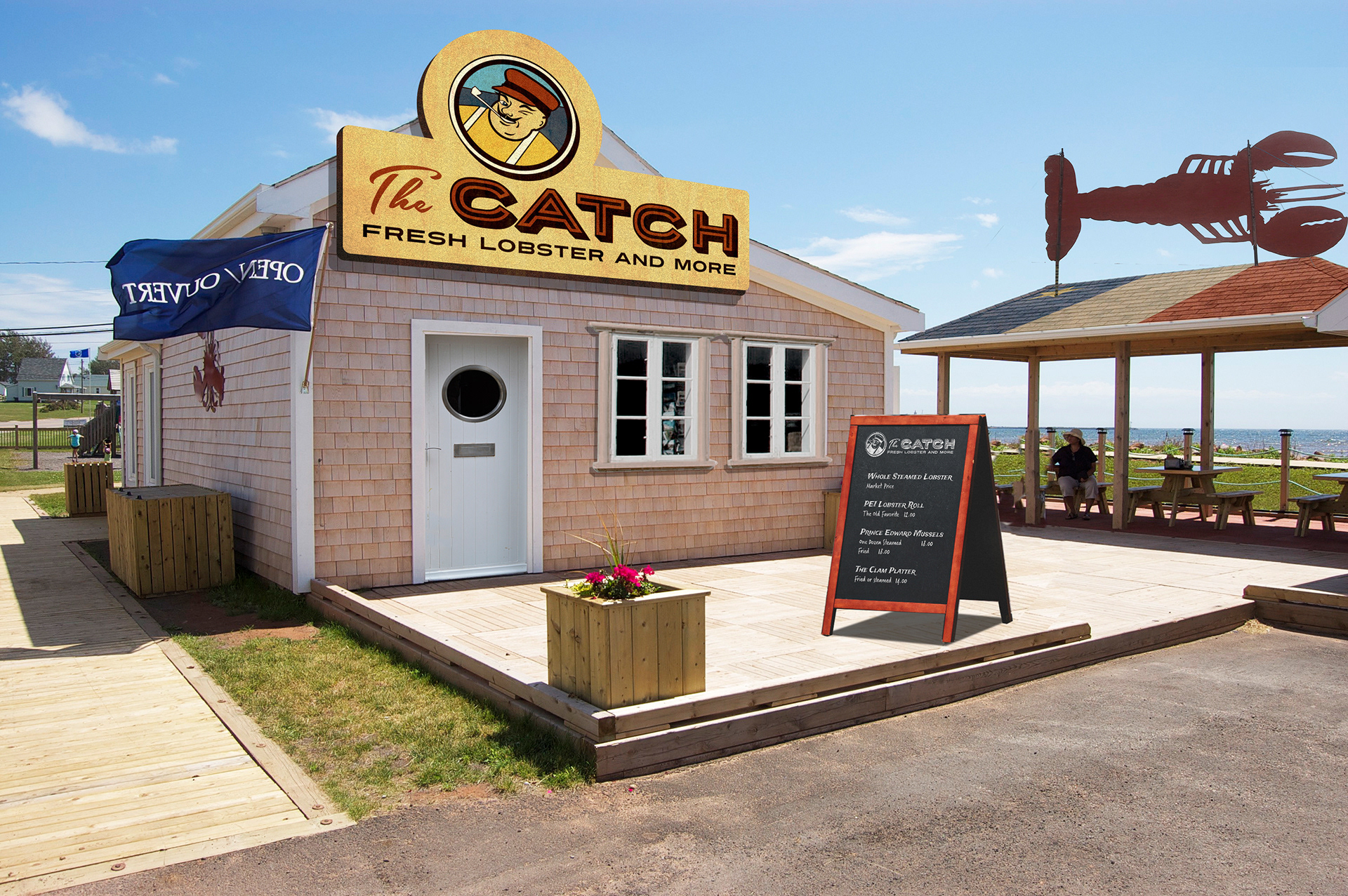
The Original "shack" was rebranded with new, more impactful signage using the logo elements and the lobster sign from the original Crabby's location.